Stats 110B Quiz 3 April 30, 1999
NAME:
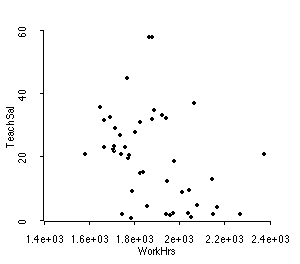
Shown below (next page) is a scatterplot of data collected from 45 cities around the world in 1991. The horizontal axis represents the average number of work hours in a year, and the vertical axis represents the average teacher's salary in that city.
1. In words, describe the relationship between average work hours and teacher's salary.
2. Here are some summary statistics for these variables:
Data set = Mac, Summary Statistics
Variable N Average Std. Dev Minimum Median Maximum
WorkHrs 45 1883. 175.05 1583. 1856. 2375.
TeachSal 45 19.929 14.748 0.7 21. 58.
Data set = Mac, Sample Correlations
WorkHrs 1.0000 -0.3722
TeachSal -0.3722 1.0000
WorkHr TeachS
The regression line is yhat = 78.9711 - 0.0313558x.
a) Graph this line on the scatterplot
b) Interpret this regression line. Tells us everything you can about what the line tells us about the relationship between work hours and teacher's salaries for these 45 cities.