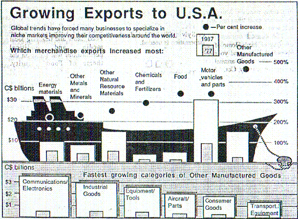
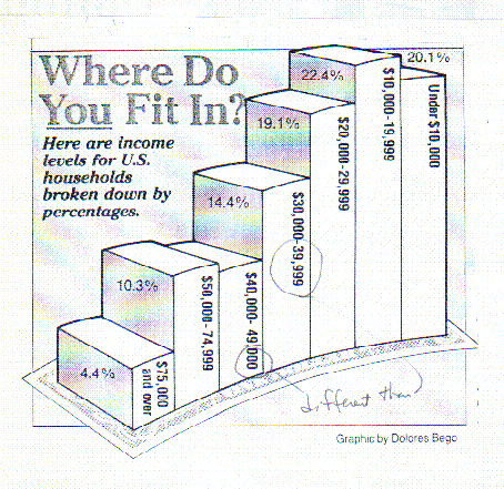
A pair of "bad" graphics involving statistical information.
A graphic presented by Morton Thiokol Inc. regarding O-Ring failure on space shuttle flights and its relationship to air temperature at the time of launch.
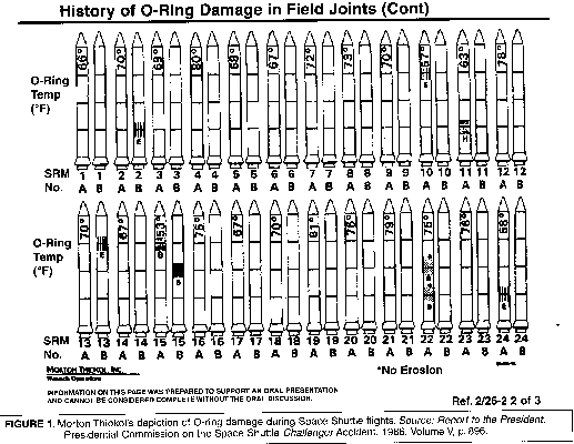
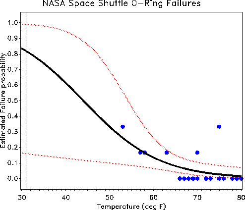
The exact same data redrawn to show the relationship between O-Ring failure and air temperature at the time of launch. The air temperature at the time of launch was 29 degrees.
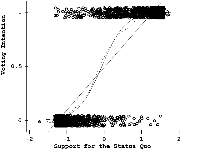
This is a good graphic, you have not learned this yet, but with a little information, I think you can figure out what the artist is trying to communicate. This was a vote for a president 1=voted for the president 0= voted against the president. Support for the Status Quo 2= strongly support, -2=strongly against, 0 = neither for nor against. Ignore the lines in the middle of the graphic.
What's your conclusion?