
How do you start to work with data? Some data sets are simply too large for one to make sense of by looking at a list of values. See the data handout
The next two chapters talk about summarizing or describing data. First, some vocabulary.
a. VARIABLE: a characteristic of a person, animal, place, thing that can be expressed as a number. For example height, weight, income, gender.b. VALUE: A value is the actual number that describes height, weight, income, gender.
c. TYPES OF VARIABLES
(i) Quantitative - have a "natural" ordering which may be discrete like the spots on a single die. They may also be continuous like time, temperature.
(ii) Qualitative - do not have a "natural" ordering like major, occupation, name brand.
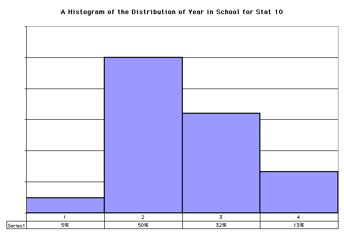
Definition: the DISTRIBUTION of a variable is its "pattern of variation". Statisticians love examining distributions of variables. And a graphical representation of a distribution can answer questions like how many are large, how many are small, how many fall between two numbers, what is the most common number?
A HISTOGRAM is a graph that shows percentages by area.
- It does not have a vertical scale along its y-axis -- it does not need one
- It has "class intervals" on the horizontal axis (the x-axis)
- The rectangles are called "bins." The key to a histogram is that it is the area of the bin, not the height of the bin, that is important. The area of the bin is proportional to the relative frequency of observations in the bin:
(#observations in the bin)/(total number of observations).
- The horizontal axis needs a scale with units.
- The vertical axis has units of percent per unit of the horizontal axis, and a scale is automatically imposed by the fact that the area of the histogram must be 100% (all the data fall somewhere on the plot).
- We also need an "endpoint convention" to be able to draw a histogram: if an observation falls on the boundary between two class intervals, to which one should we associate it? The two standard choices are always to include the left boundary and exclude the right, except for the rightmost bin, or always to include the right boundary and exclude the left, except for the leftmost bin.
To plot a histogram, we first need to sort the data into increasing order, and pick the class intervals. We then count the number of data that fall in each class interval, and plot rectangles with the areas proportional to the relative frequencies with which the data fall in each class interval.There are no hard-and-fast rules for determining appropriate class intervals, and the impression one gets of how the data are distributed depends on the number and location of the intervals.
Remember the total area under the histogram is 100%; histograms are usually used for large datasets.
i. Divide the data into CLASS INTERVALS.
ii. Determine what percentage fall within each class interval.
iii. Determine the appropriate height by dividing the percentage in the class interval by the width of the class interval.
iv. Draw the histogram.
- Center: what is the "typical" value?
- Symmetry or skewness: are the data evenly divided is there a tail? Are there bumps?
- Spread: are the data near to each other or far apart?
- Exceptions ("outliers"): are there points that don't fit the general distribution?
- Remark: the histogram may be bell-shaped, but not necessarily so. They can take all kinds of shapes.
The histogram can be used as a tool to compare different groups. See pages 45-46 of the text. A rough outline:
Review Exercises: 4a, 4c, 4d, 7, 8a, 8c
Return to the Fall 1998 Statistics 10/50 Home
PageLast Update: 4 October 1998 by VXL