Economics 40/Statistics M11 Lab 1: Getting Started
Due Friday, October 22, 1999
Purpose
: The purpose of this lab is to get some practice handling some data and constructing histograms.Advice: This is not a complete Excel tutorial. You will need to teach yourself Excel. (Or you can use another package, but please be certain it can do what it needs to do for this course.) You can get help for Excel either my Excel screen captures, from the TA, from me, your friends, books on Excel, whatever. The Excel screens on this web page come from the Office 97 version of Excel for Windows on PCs. Other versions of Excel may not give screens exactly like the ones I produced for you here.
Data
: We will use some mutual fund data. To get this data, you'll need to visit the course web page at:http://www.sscnet.ucla.edu/99F/econm40-1/
and click on the "LAB PAGE" link on the upper right of the screen. Alternatively, go directly to:
http://www.stat.ucla.edu/~vlew/stat11/datasets.html
and get the data. There are two data sets for this assignment. The first contains 135 "Large Blend" mutual funds (funds whose objective is growth by investing in large established companies which may provide both growth and possibly income, some of these are indexed funds). The second is a sample of 59 "Growth" mutual funds (funds whose objective is purely growth, but not aggressively).
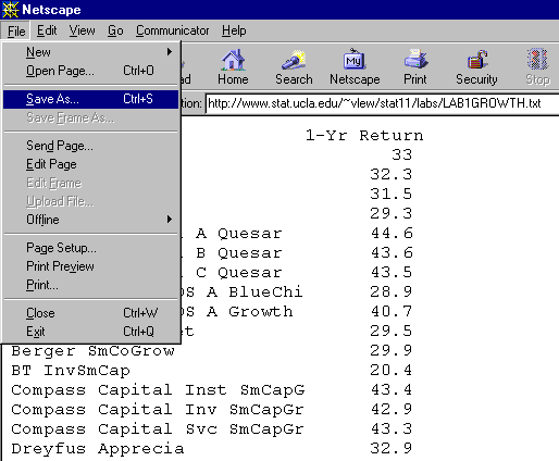
You can get the data two ways: (a) left click on the link so you can "see" the data, then choose the "FILE" and "SAVE AS" and save the file to your computer. It should look like this on a PC:
or (b) right click on the link and save it directly to disk (if you know the difference between right and left clicking, I don't need to explain how to save it to disk to you).
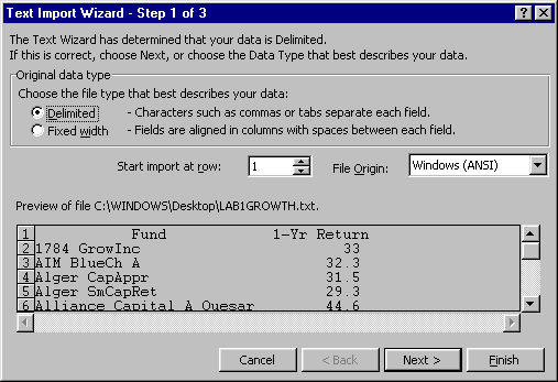
When you read the data into Excel, you will be asked if it is a "Delimited File" or a "Fixed width" file. The two datasets are fixed width. Follow the Text Import Wizard's instructions and you should wind up with two columns of data as pictured in the next section.
ASSIGNMENT
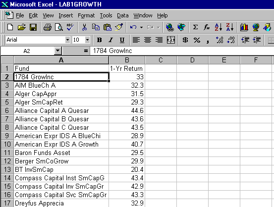
:It should look like something like this (for the growth data):
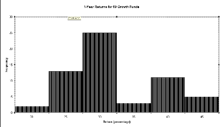
An example of the resulting "frequency" histogram from Excel:
So to recap:
1. Print out the sorted data for each dataset on its own pages.
2. Print out "relative frequency histograms" for each dataset, see pages 30-33 for details on what a "relative frequency histogram" should look like. Remember, Excel actually produces "frequency histograms" discussed on pages 24-27. But you can take the information from the "frequency histograms" and turn them into "relative frequency histograms"
3. Write a brief description of each "relative frequency histogram" and then compare the two (blend vs. growth funds).
4. Staple it all together (data printouts, frequency histograms, relative frequency histograms and write-up), put your name AND your TA's name on it and turn it in on October 22, 1999.
Hints, Tips and Advice:
To make a histogram, you need to use the Data Analysis Tools. If it is already on, it should look like this when you click on "TOOLS":
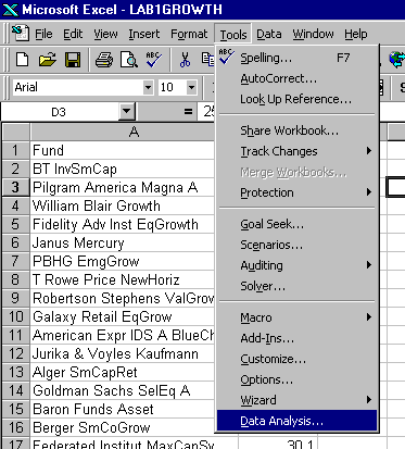 If your "TOOLS" menu doesn't look like this, go to "Add-Ins" in the "TOOLS" menu and click on the Analysis Toolpak box to turn it on. Here is an example:
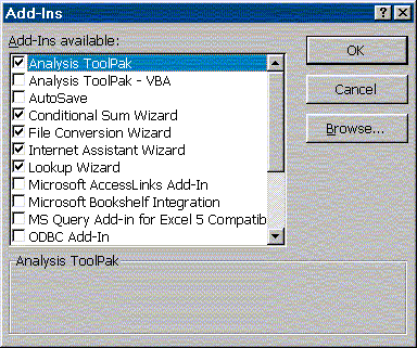
Excel is tricky (at least on a Mac) when it comes to using the Data Analysis Tools. While it easily does numerical calculations, it will not put histograms in the same workbook as the data. You must choose the "New Workbook" option. This is irritating, because you must create a new workbook for each histogram. Let me know if you figure out a way 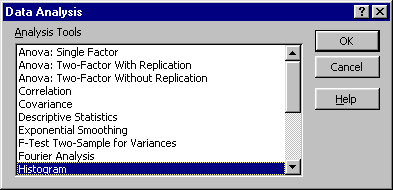 around this. It is not a problem on PCs.
Once you click on "DATA ANALYSIS" you should see this box:
Click "OK" and follow its instructions. I strongly recommend that you give Excel "class intervals" or "bins" rather than letting it decide for itself how it wants to categorize your data. To do this, just type in some appropriate bin endpoints (perhaps starting with 10 and going to 50 in increments of 5) in an empty column on the worksheet and when Excel asks for a "bin range" give it the one you have typed in.
To "clean up" your histogram, click your right mouse button (on the PC) on whatever object (axis, legend, title) you want to beautify -- a new set of options should pop-up and you can do things like change colors and re-scale the axes.
Your first histogram may not look quite like mine. It will probably be difficult to read and nothing like the real histograms in Chapter 1.5. Play with the options. You are not graded on "beauty" but the "relative frequency histograms" that you will use for comparison should fulfill the requirements identified in Chapter 1.5 of your text. At minimum, they must be comparable. I will want all the histograms printed out on their own sheets of paper and it should be understandable (through the use of titles) to someone who, will realize with one look that the data is mutual fund returns.
I examine your labs to get a sense of what is the best and what is the worst, but the reader for this course actually grades them.